UX Design Case – Flight App
Introduction
My aim for this project was to design a native mobile app for a fictional airline, with the primary goal of creating a seamless flight booking experience that alleviates user frustrations.The project involved all key steps, starting with research and ending with a mid-fidelity prototype.
Tools used
- Miro
- Figma
- Google Docs
- pen and paper
Design process
1. Research – collecting data
I chose usability testing for the research step of my project because it provided direct insights into user behaviors and pain points. By observing a real user interact with the product, I could identify specific usability issues that may not be evident through other methods.
Usability testing
Usability testing provided me with valuable qualitative insights into the flight booking experience. I carried out a remote usability test with a user interacting with the Ryanair and British Airways airline apps. For this task, I utilized a usability test script that featured an introduction, detailed interview questions, and specific user tasks, accompanied by a scenario outlining flight destinations, duration of stay, and travel dates. Throughout the process, the user was encouraged to perform various tasks while being asked questions about the experience and feelings regarding each stage of the booking process.


I also evaluated two additional usability tests focused on Aer Lingus and Eurowings apps. In total, three participants attempted to book a flight using four different airline apps.
The usability tests identified various pain points users encountered, which I noted for future design improvements:
- lacking price details for calendar dates: users would appreciate seeing prices displayed on the calendar dates when selecting their travel dates, as this would help them avoid exploring numerous options to find the best choice.
“Would be nice to see prices popped up on the calendar, would save me a ton of time!”
- unclear which flight is being displayed: users are uncertain whether they are looking at an outbound or return flight. This should be more clearly indicated.
“It needs to be clearer that this is definitely this particular flight.”
- confusion about fare options: users had difficulty identifying the available fare choices. The options were not clearly presented, and the details for each fare were hard to locate, which discouraged some users from choosing a higher-priced option.
“Maybe if there was a small breakdown of what the differences were between the various fares that you could see at a glance.”
- unnecessary use of pop-ups: in some occasions users find them frustrating, as they cover the entire screen and obscure the underlying information. This content could be presented directly on the screen instead.
“That’s frustrating, I can’t see the other info now.”
- stopovers are not clearly indicated: users are going through the booking process unaware that their flights include stopovers, which should have been communicated more effectively.
“It doesn’t say anything about a stopover here. I’m annoyed that I’ve gone through the whole booking process to realise that.”
2. Analysis – transforming data into insights
By utilizing analytical techniques like affinity diagram and customer journey map, I conducted a careful analysis of the gathered data. It gave me a thorough understanding of user experiences and ensured that the design process was based on actual user needs, resulting in more effective and empathetic solutions.
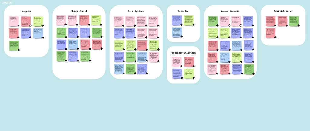
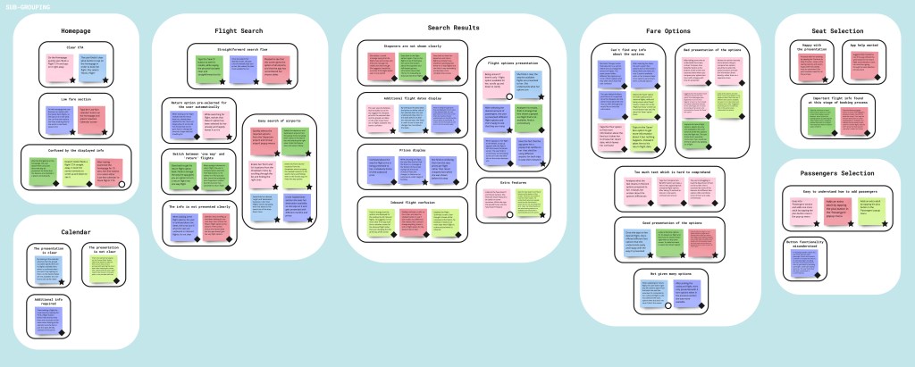
Affinity diagram
While creating the affinity diagram I was able to organize user research data and insights into coherent groups. During this process, I started to notice emerging patterns:
- clear CTA
- low fare section
- straightforward search flow
- easy search of airports
- stopovers are not shown clearly
- additional flight dates display
- prices display
- flight options presentation
- inbound flight confusion
- extra features
This process helped to identify user needs, prioritize features, and clarify information, while sharing understanding of users challenges and goals.

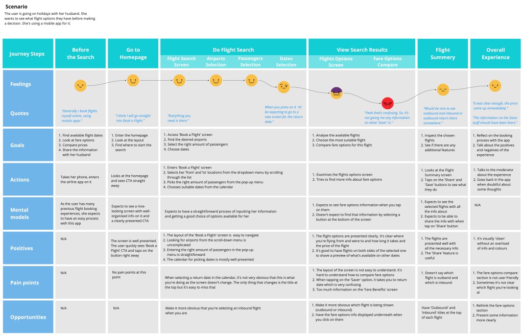
Customer journey map
Identifying common patterns in the experiences of all tested users allowed me to develop a clearer understanding of the average customer journey. To demonstrate this, I created a customer journey map that outlined each phase of the flight booking process, showcasing the steps users followed while interacting with the airline apps. This map highlighted crucial touchpoints, pain points, and emotions, providing insight into the user experience from their perspective by pinpointing areas of struggle, positive outcome and user needs. This process revealed several key areas for improvement:
- dates selection: it’s not clear that you’re selecting a return date.
- flights options screen: the layout of the screen is not easy to understand.
- fare options compare: fare options information doesn’t appear when you select them.
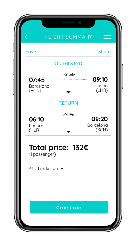
- flight summary: it’s not apparent which flight is outbound and which is the return.
3. Design – shaping touchpoints
Considering the goals, behaviors, mental models, and pain points identified in the earlier steps, I created visual representations of the flight booking journey through a flow diagram and pen-and-paper sketches. It helped maintain a focus on functionality, resulting in more effective, user-centered designs.
Flow diagram
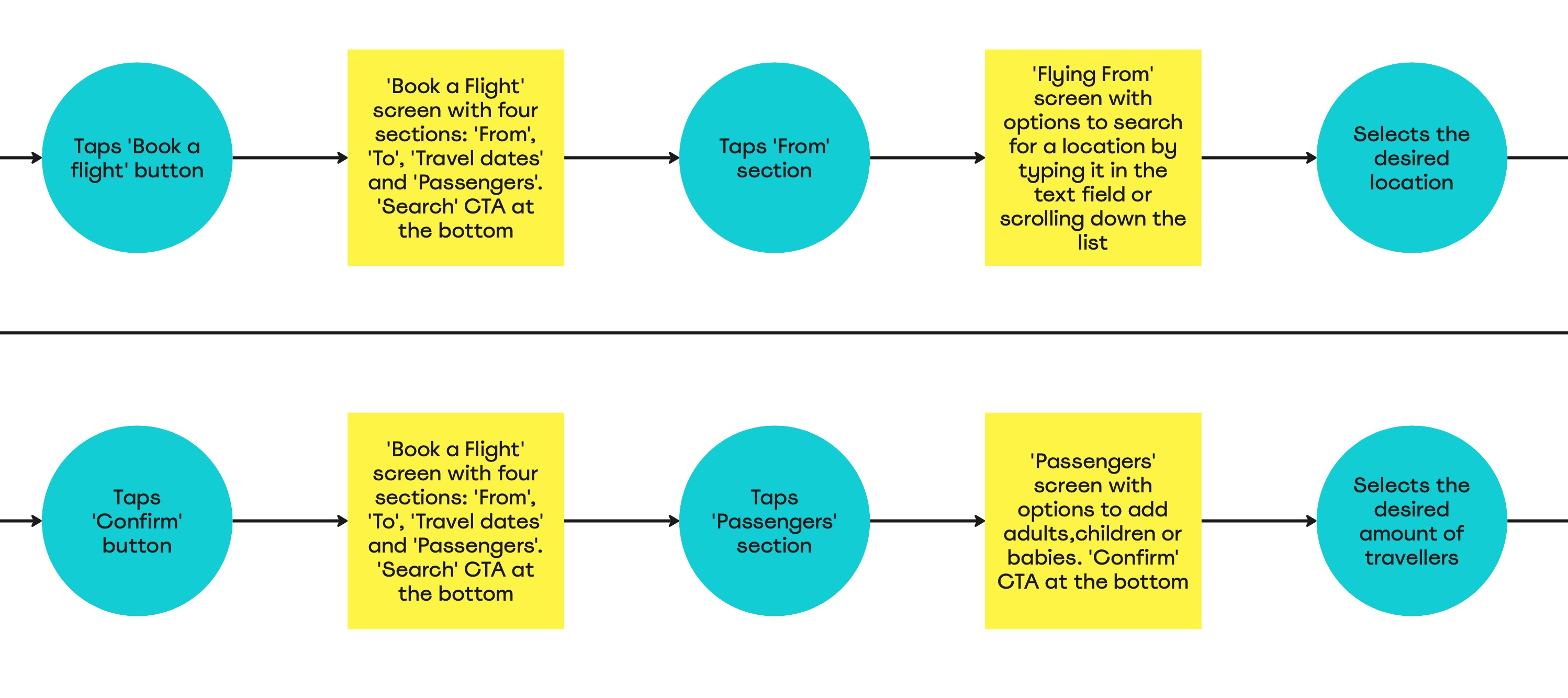
I created a flow diagram to represent the “happy path”—the optimal journey for a user booking a flight. This diagram outlined a series of steps, breaking down the process into specific screen states and user actions. It helped in understanding user interactions with the interface.
Pen-and-paper sketches
Using the flow diagram as a guide, I created rough sketches to iterate and explore ideas of the app further. As I sketched the screens and defined how to lay out specific elements, I assessed whether the user flow was efficient or required adjustments. In this case, I didn’t think it required major changes.

4. Prototype – executing concepts
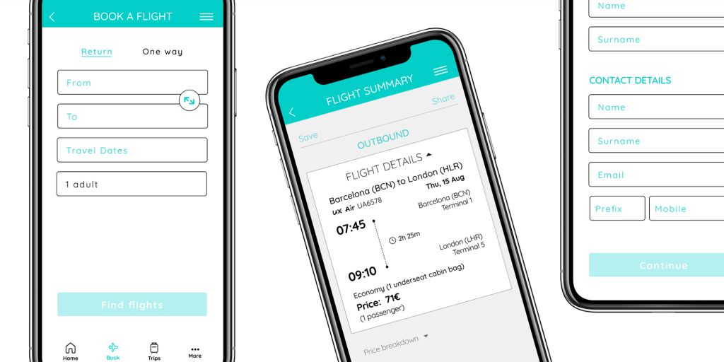
I developed a mid-fidelity prototype to support user testing, enabling real users to engage with the app designs and uncover usability issues early in the process.
Mid-fidelity prototype
Using the pen-and-paper sketches as a foundation, I created a medium-fidelity interactive prototype to demonstrate user interaction and functionality. While building the prototype, I ensured that I incorporated the user feedback collected in earlier stages to create the best possible experience for booking a flight.
Kept screens clean and organized:
During testing, some screens were found to be overloaded with information which caused confusion. I added ample whitespace to avoid clutter and maintain a consistent layout design.
Made sure CTAs are clear:
At times, users found it difficult to determine the next steps on certain screens. I ensured that CTAs are clear on every screen as they’re crucial for guiding users and helping them easily understand what actions to take next.
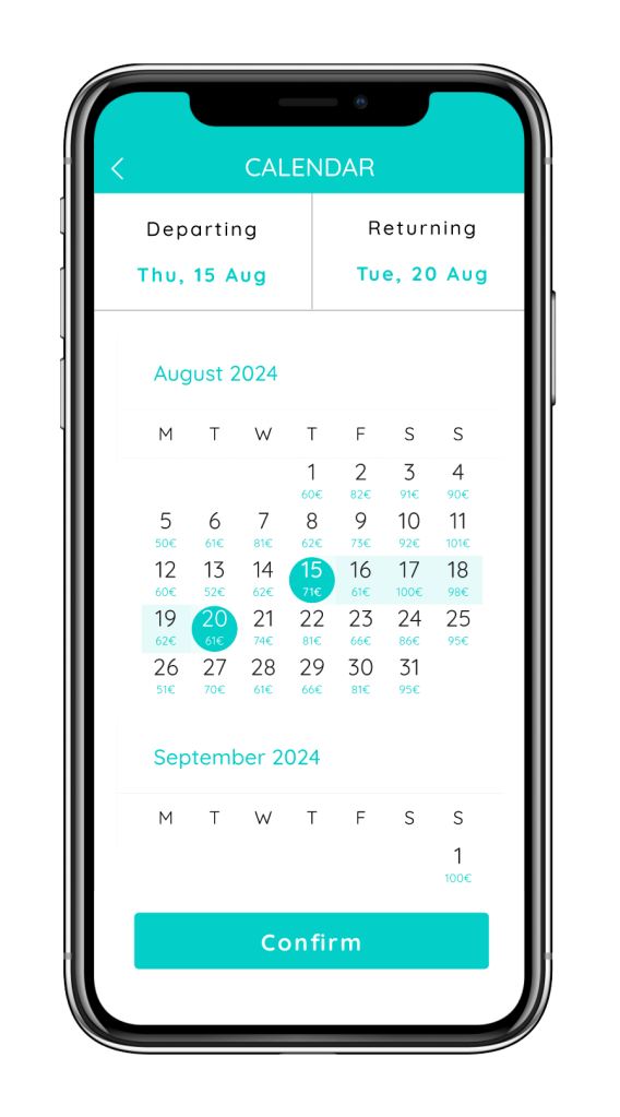
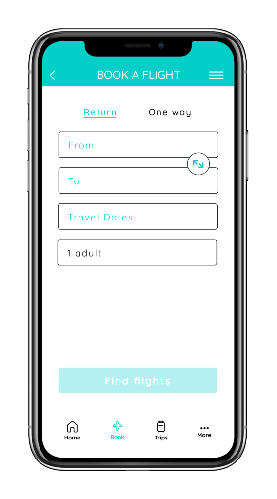
Included prices on the calendar dates:
Some users expressed a preference for seeing prices directly on the calendar dates to save time when selecting the best dates. To accommodate this, I added the prices underneath each date for easier reference.
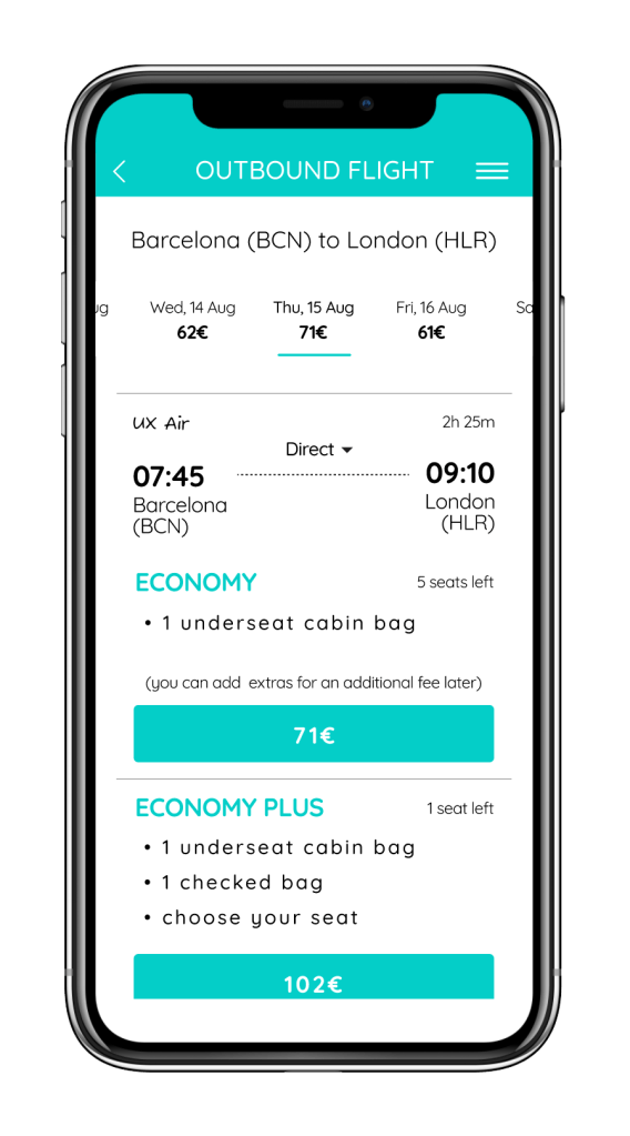
Ensured fare options are easily visible:
Since users found fare options hard to find, I placed them on the same screen as the flight details. Tapping a flight expands the screen to show the available fares.

Indicated whether the flight is direct:
In one app, users completely overlooked the information about layovers because it wasn’t clearly indicated. I ensured that this information was clearly displayed at all times.
Included extra features:
Some users appreciated having the ability to save and share their searches, as it allowed them to pick up where they left off more easily. For this reason, I incorporated these options into my design.
5. Annotation – facilitating handover
Finally, I added annotations to the prototype to provide essential context and clarification for design elements. This serves as clear instructions for developers to ensure accurate implementation, and facilitate collaboration.

