UI Case Study – Banking App
Introduction
My aim for this project was to design an intuitive user interface for a banking application for a fictional brand that would stand out from the crowd. The project involved designing the UI for mobile, tablet and desktop devices, ensuring that it functions responsively across all screen types.
Objectives
The challenge was to create these screens for the app across mobile, tablet and desktop devices:
- Accounts Overview screen which provides a summary of all the accounts.
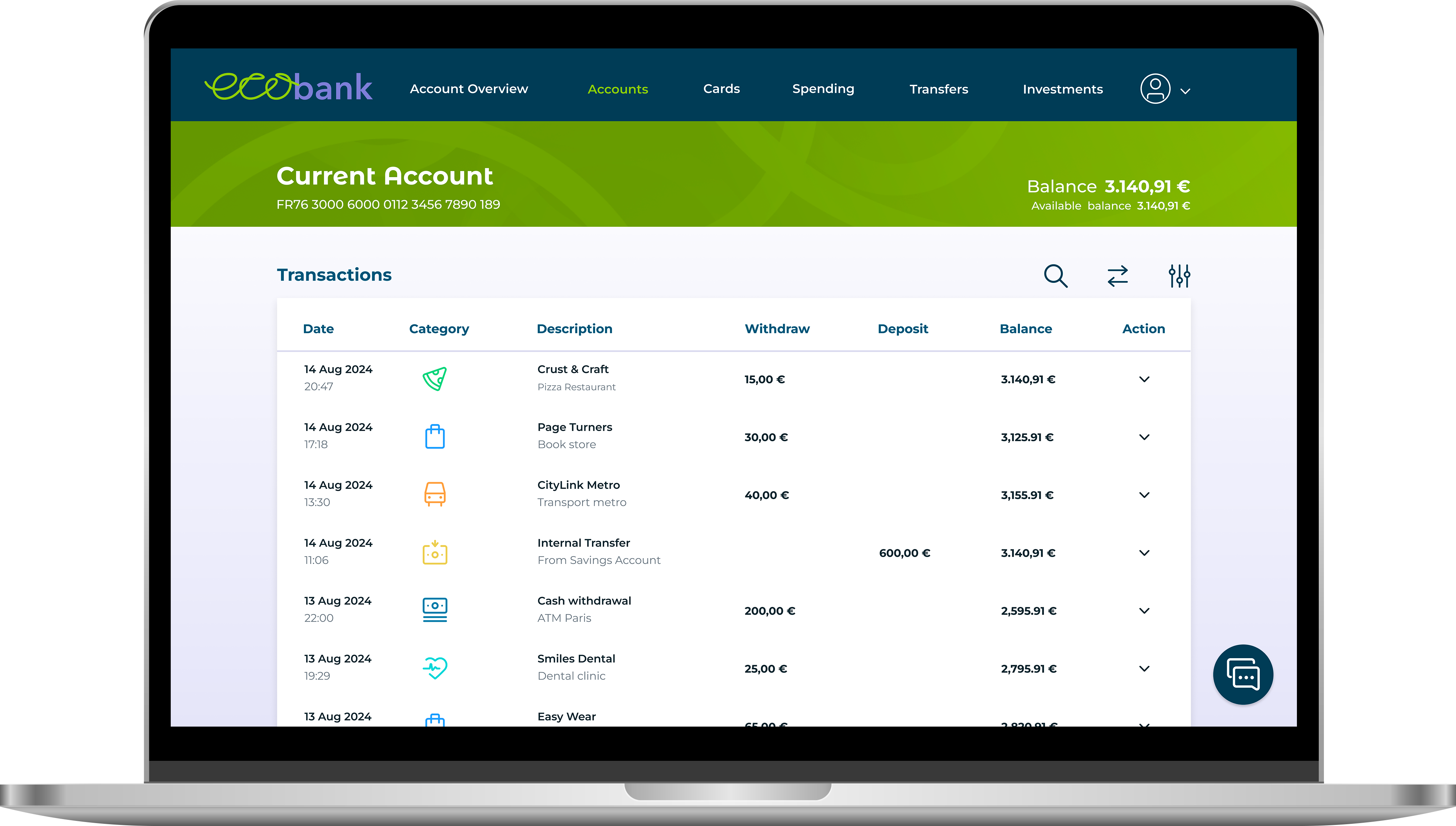
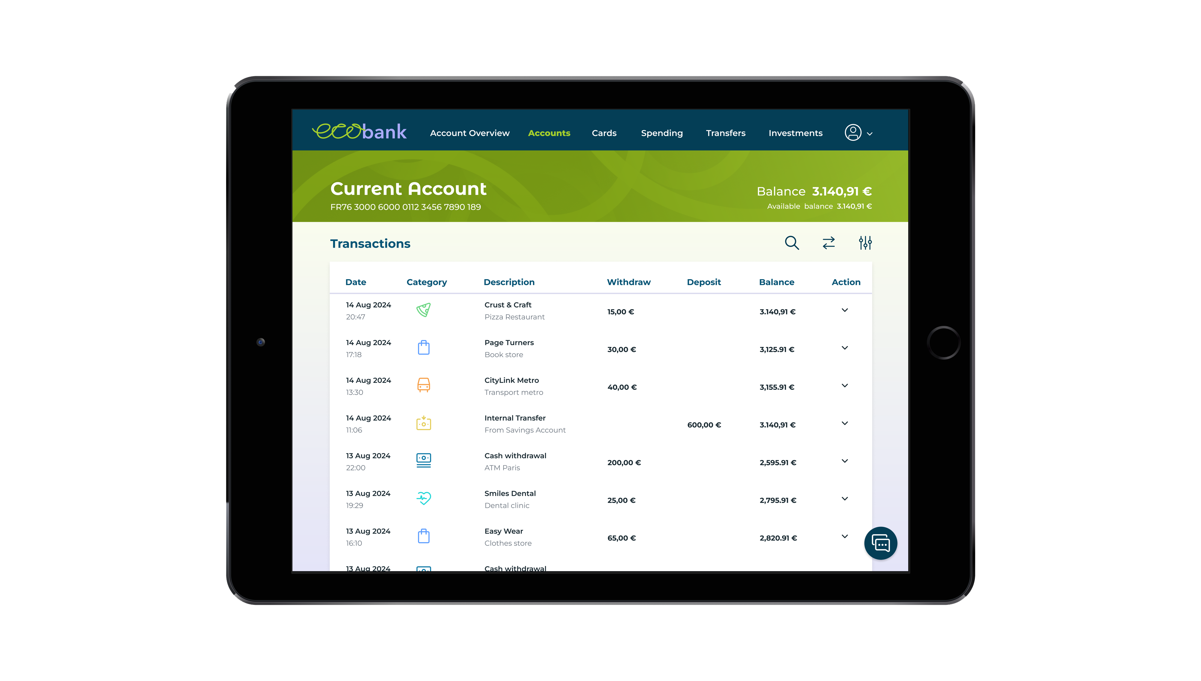
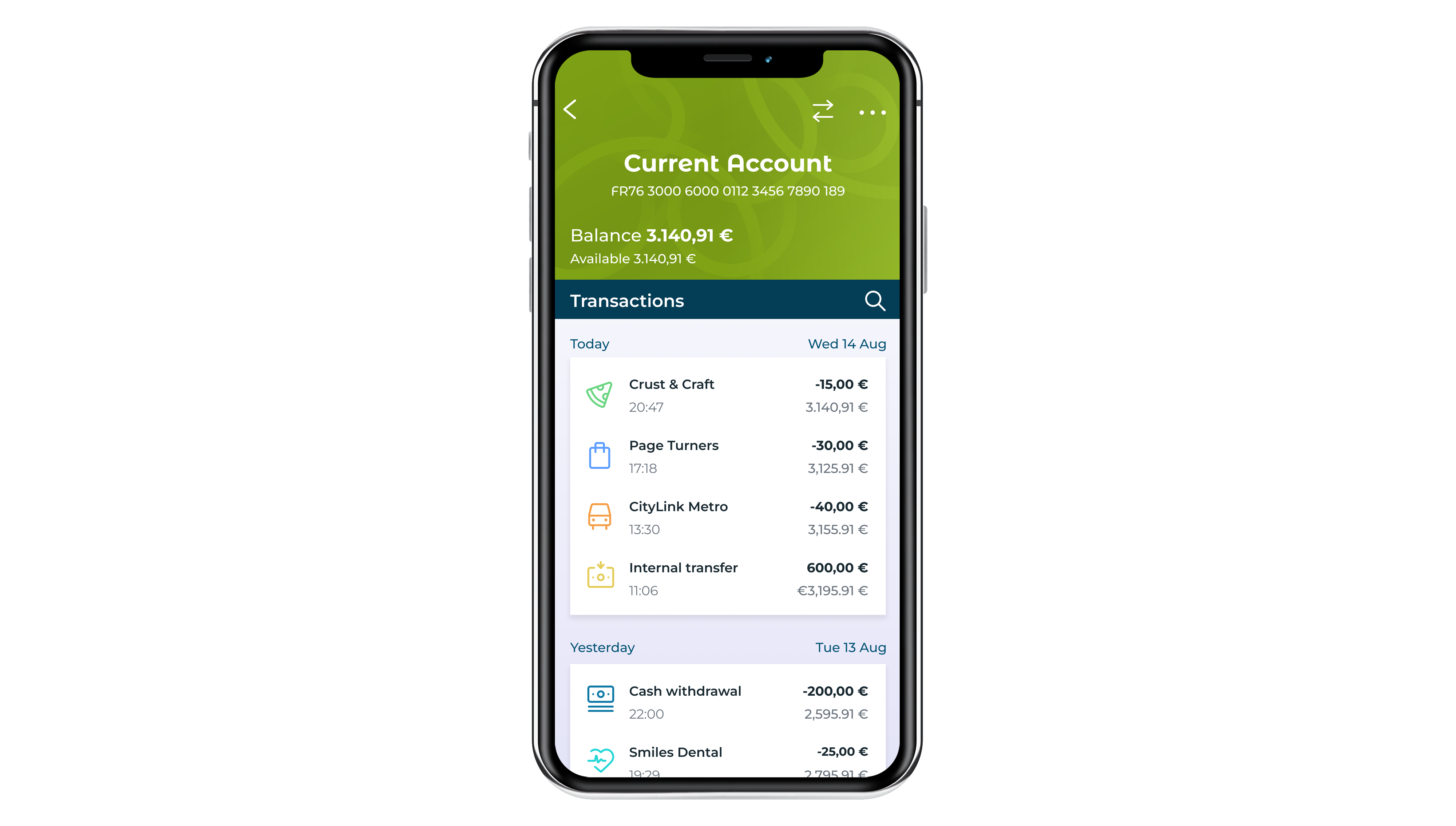
- Current Account screen which displays the daily spending account.
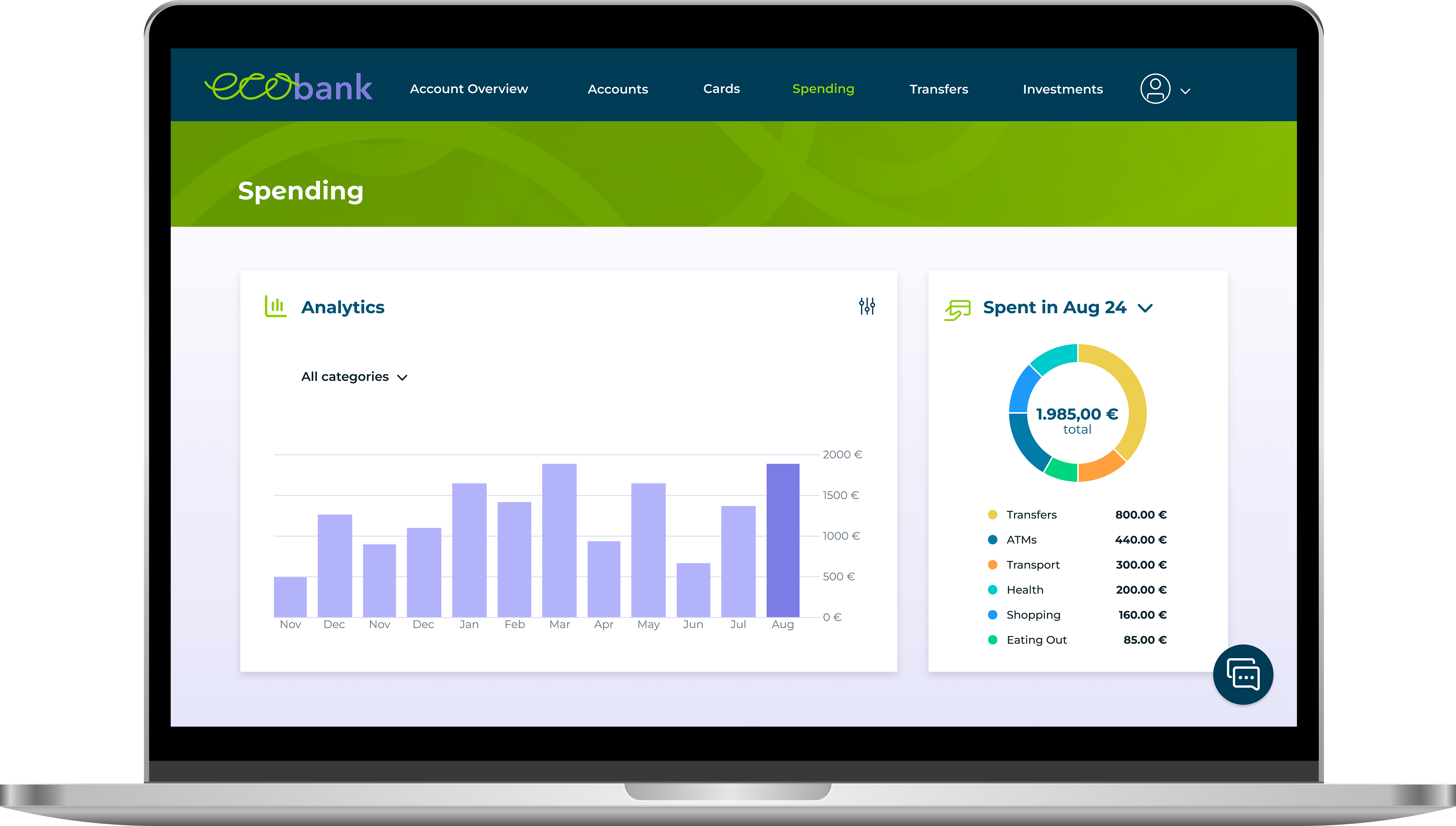
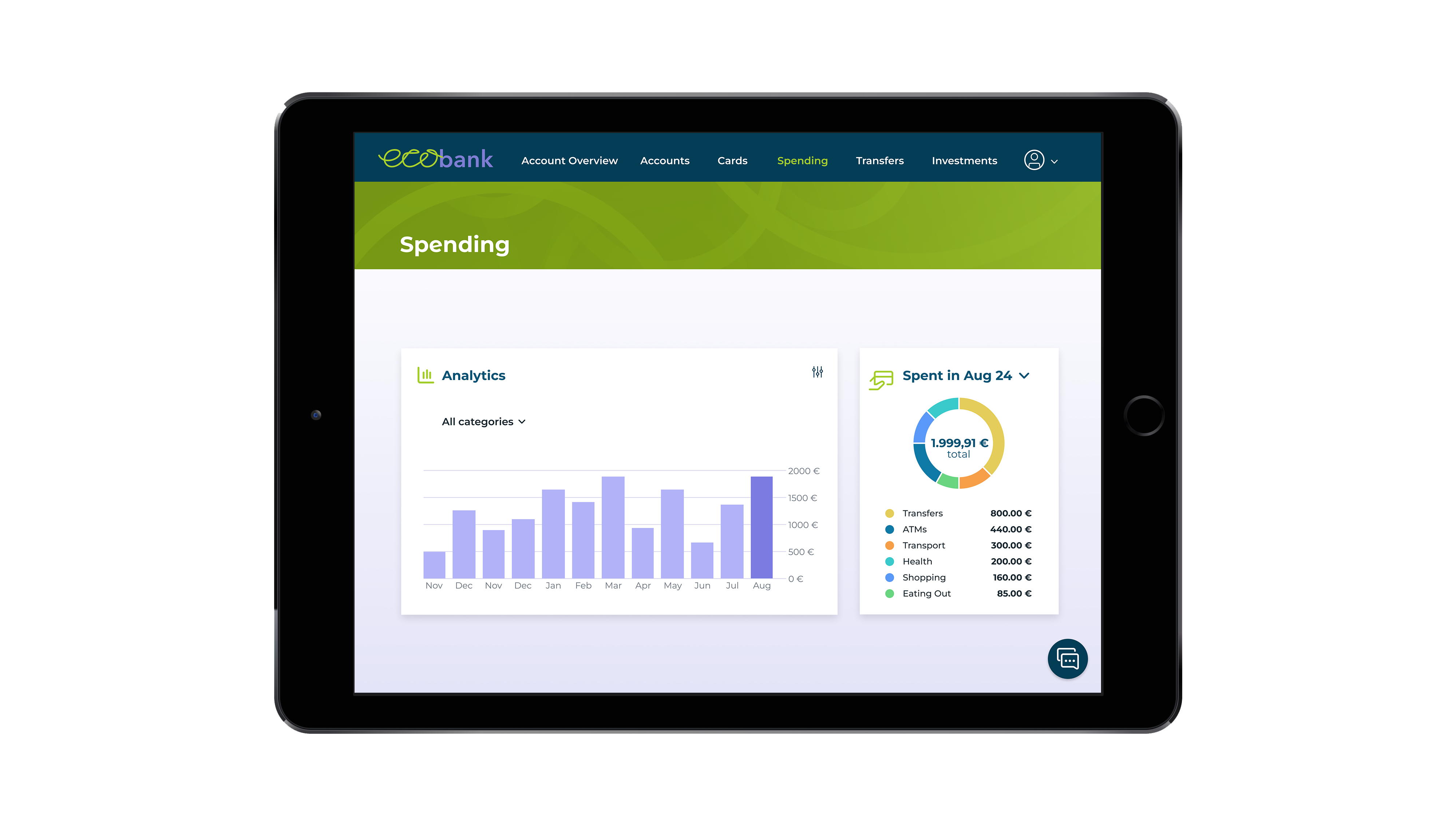
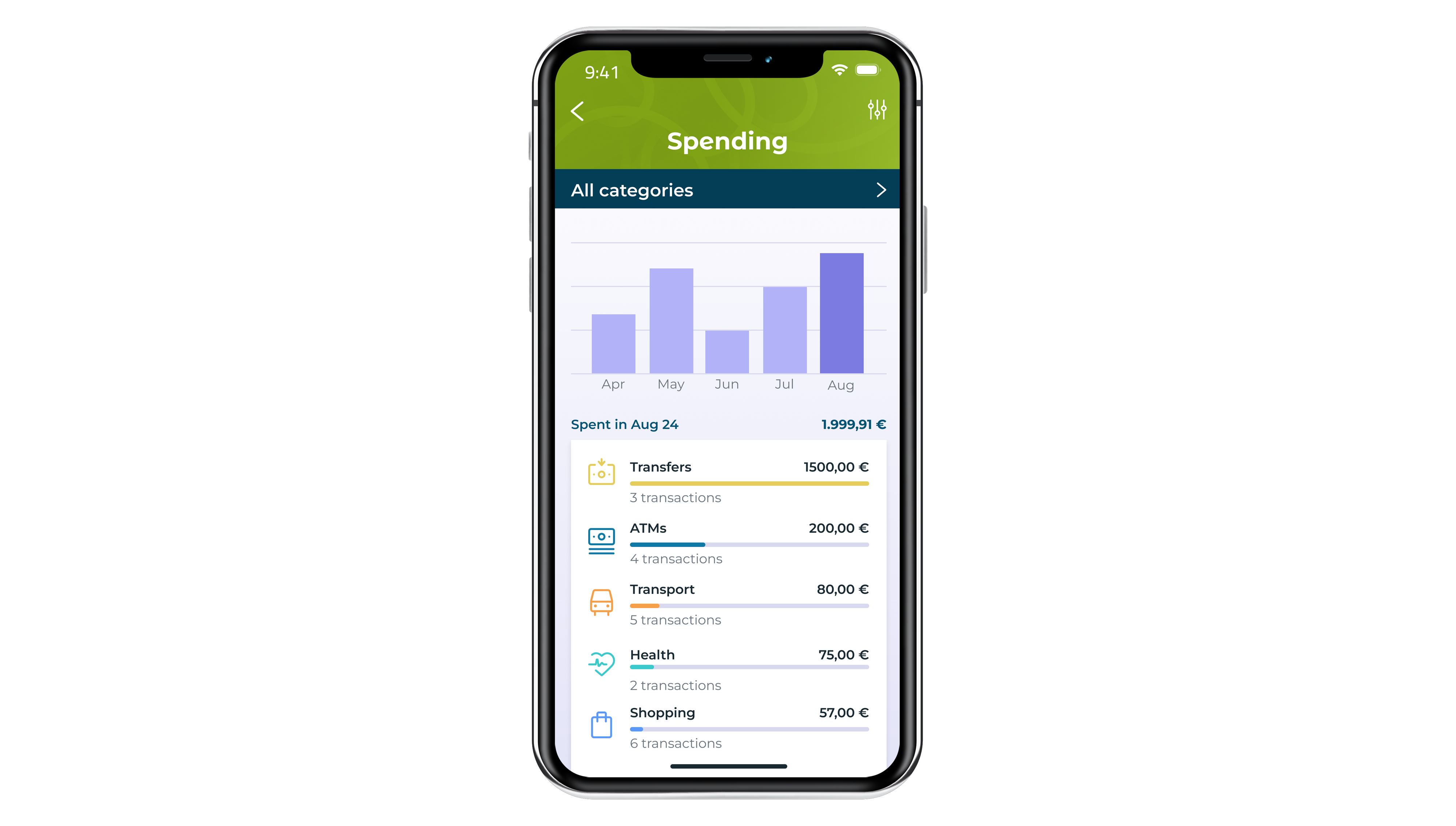
- My Spending screen which shows spending over time, featuring data visualizations.
The design should reflect qualities of being:
- clear – present information in a logical and uncluttered way
- playful – show some personality through colour and shape
- trustworthy – users must feel they can trust the product
Solution
I developed a UI design solution that embodies the brand’s values by first conducting research on its identity, target audience, and market trends. I then created a UI library to provide a cohesive design framework. Through multiple iterations, I refined the designs to enhance both functionality and aesthetics, ensuring that everything remained aligned with the brand’s core principles.
Tools used
- Figma
- Adobe Illustrator
- pen and paper
Design process
1. Research – understanding user needs
To ensure the final design is both user-friendly and effective, I focused on the following elements:
- mood board
- grid system
- logo
- colour palette
- fonts
- UI components
- icons
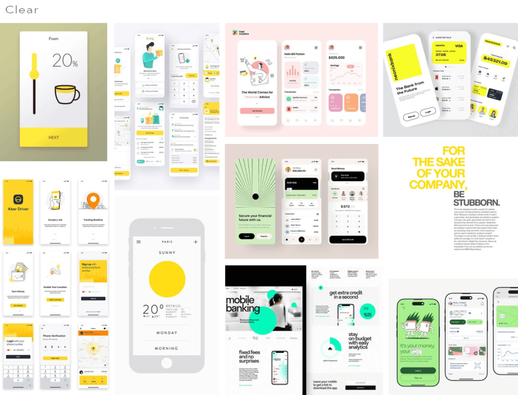
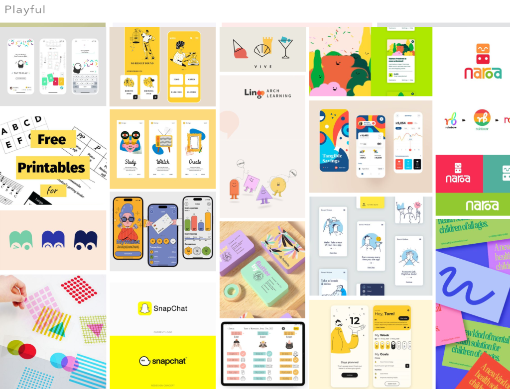
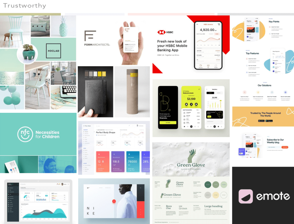
Mood board
I put together a moodboard filled with visual references that served as a source of inspiration. The references needed to convey clarity through generous white space and clear typography, playfulness by incorporating vibrant colors and shapes, and trustworthiness to evoke a sense of reliability.
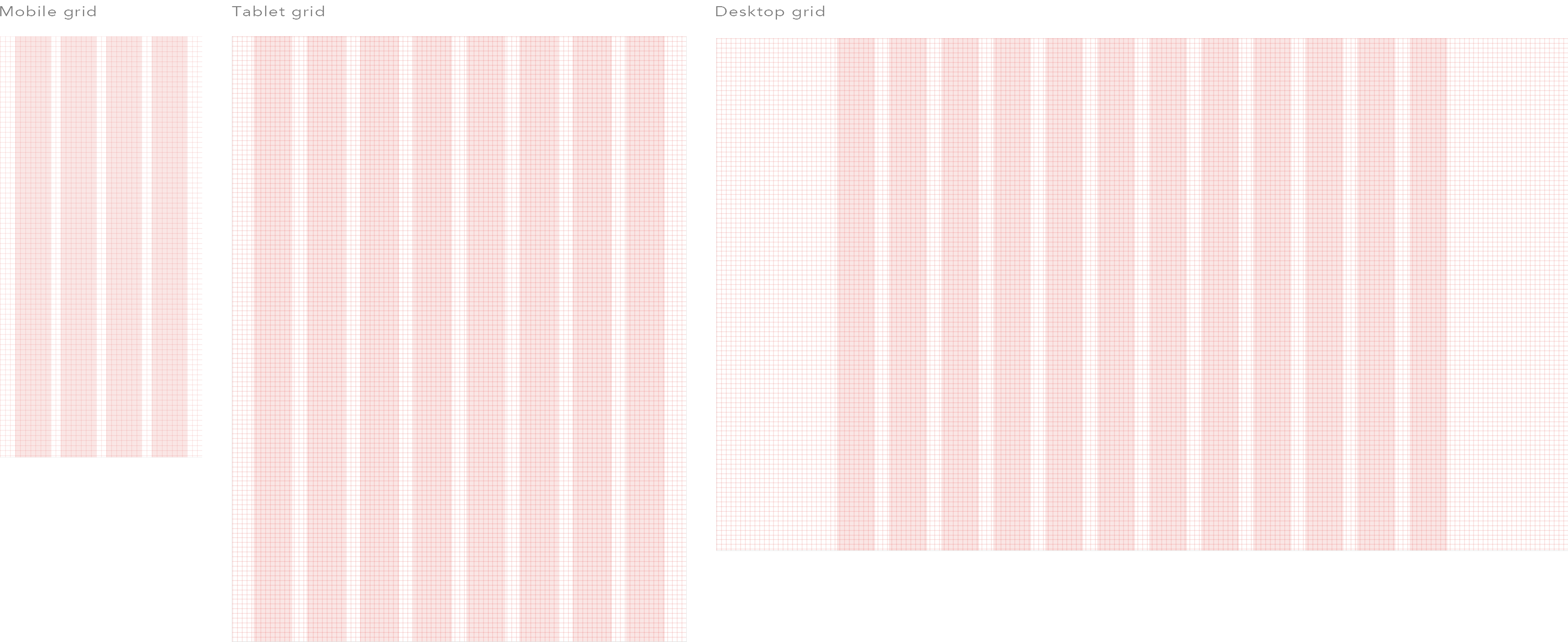
Grid system
I established a responsive 8-point grid system with columns tailored for various screen sizes (mobile – 4 column grid, tablet – 8 column grid, and desktop – 12 column grid). With a solid and thoughtfully designed grid in place, I was able to work more efficiently and stay organized from the beginning.
Logo
When designing the logo, I wanted to create a visual balance between playfulness, clarity and trustworthiness, reflecting the brand’s values. The fictional bank’s name consists of two words ‘eco’ and ‘bank’. For the first word ‘eco’ I handwrote the lettering to give it an organic touch, evoking a sense of creativity and playfulness. For the second word ‘bank’, I used a clean, straight font to convey professionalism, clarity, and trust – the foundational qualities of a financial institution.
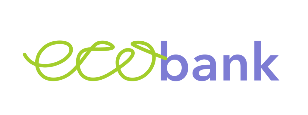
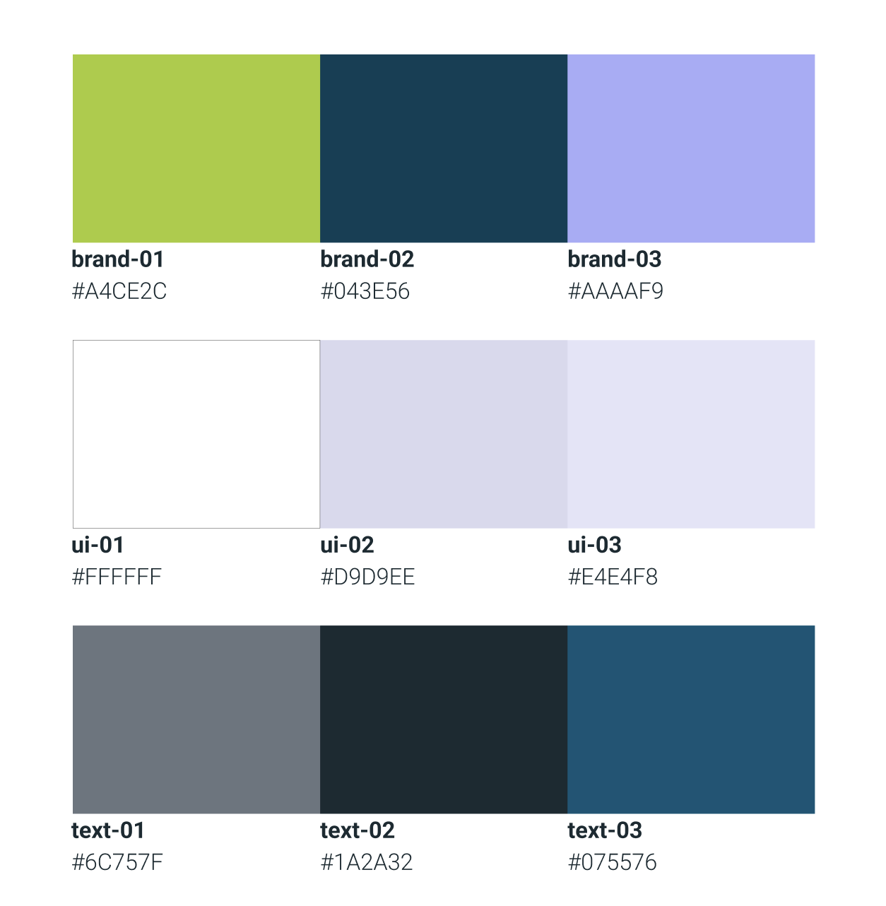
Colour palette
When selecting colours, I chose bright colors like bright green and purple to give the website a playful and energetic feel. Dark, classic colors like deep blues and blacks were incorporated to evoke a sense of trust and reliability. Meanwhile, the use of white and light colors ensured clarity and simplicity, making the content easy to read and navigate. Together, these color choices created a balance between playfulness, trustworthiness, and clarity.
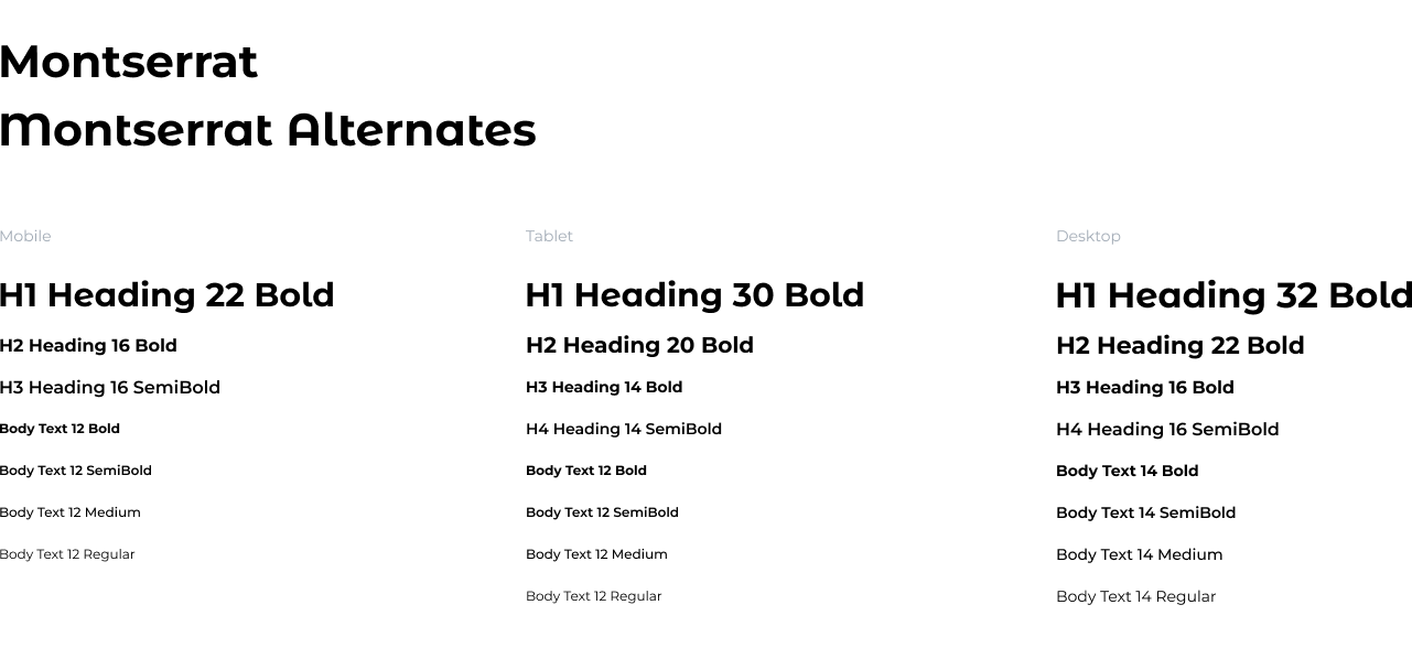
Fonts
I chose Montserrat as the primary font for the UI because of its modern, clean, and geometric style. It offers a strong visual presence while ensuring excellent readability on all devices. The font’s versatility, with its diverse weight options, makes it ideal for different elements, from headings to body text. For the largest headings, I opted for Montserrat Alternates to give them a more distinctive, edgy appearance.
UI components
I designed UI components to enhance consistency, efficiency, and scalability in my design. By constructing reusable elements, I simplified development, maintained a unified user experience, and facilitated modifications.
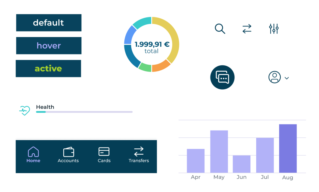
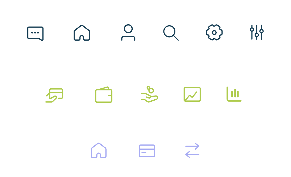
Icons
For this project I decided to use pre-made icons sourced from the web. I chose these icons for their simple and clean design to enhance clarity and improve user experience. They maintain consistency across the interface and respond effectively to different screen sizes. I adapted the icons to my UI design by modifying their colors to match my established color palette.
2. Design – shaping user interfaces
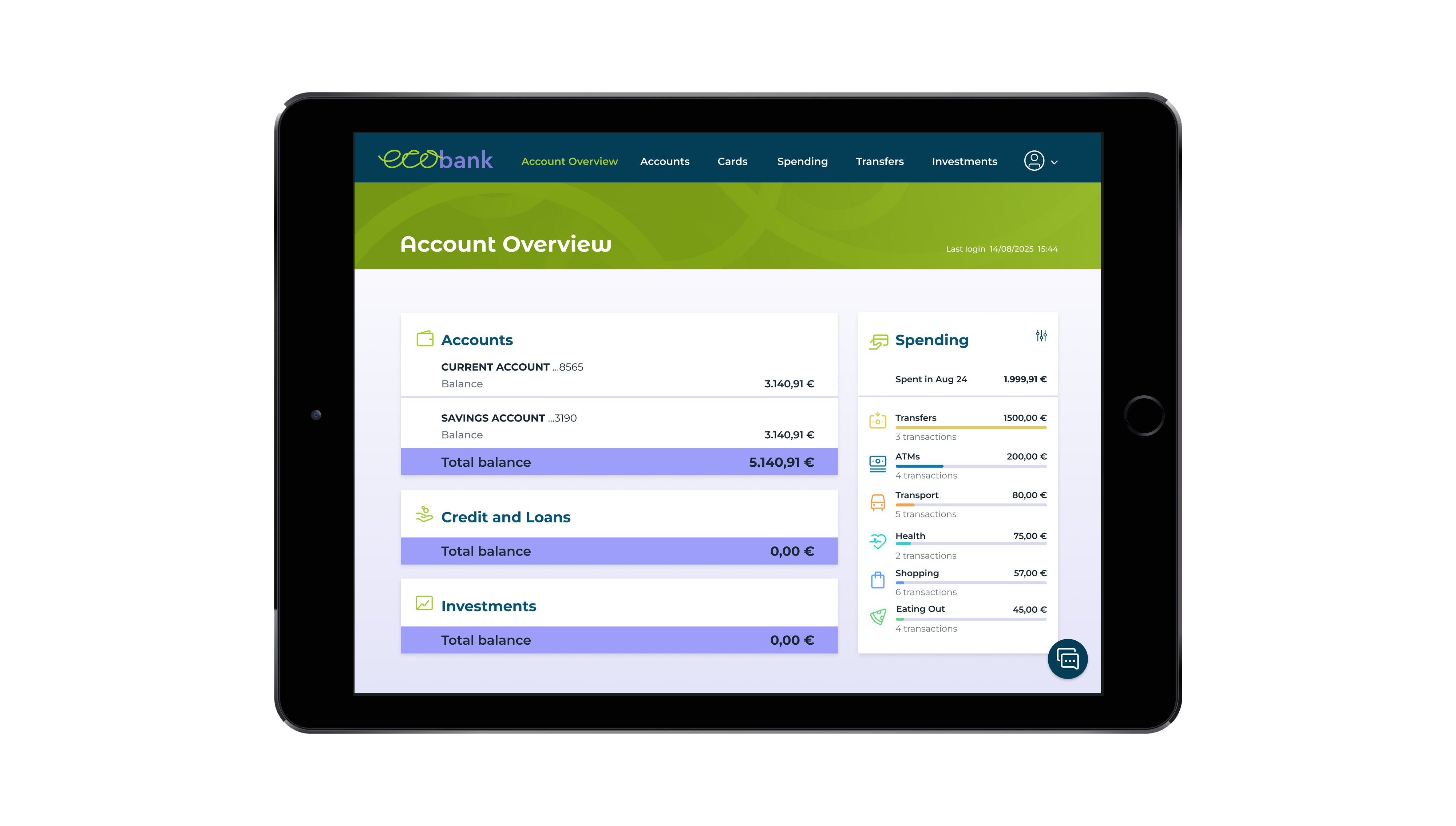
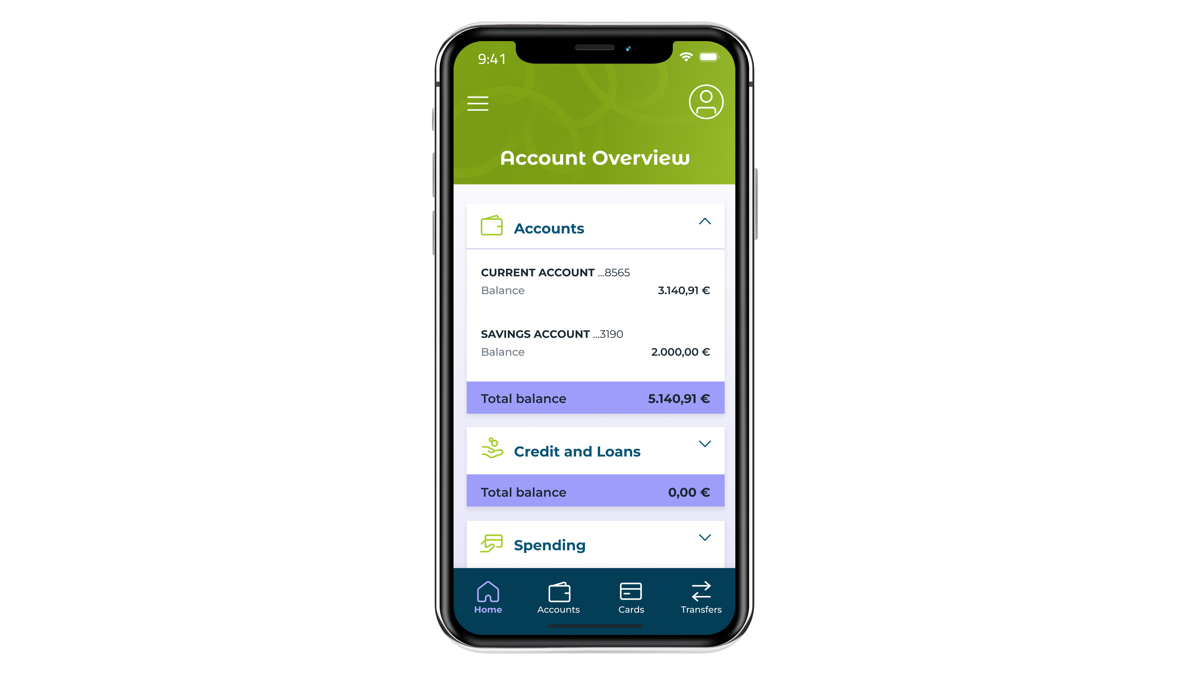
After defining the key elements, I designed the screens for the task—account overview screen, current account screen, and my spending screen—optimized for mobile, tablet, and desktop. By following essential design principles, I created a smooth and intuitive user experience with easy navigation.
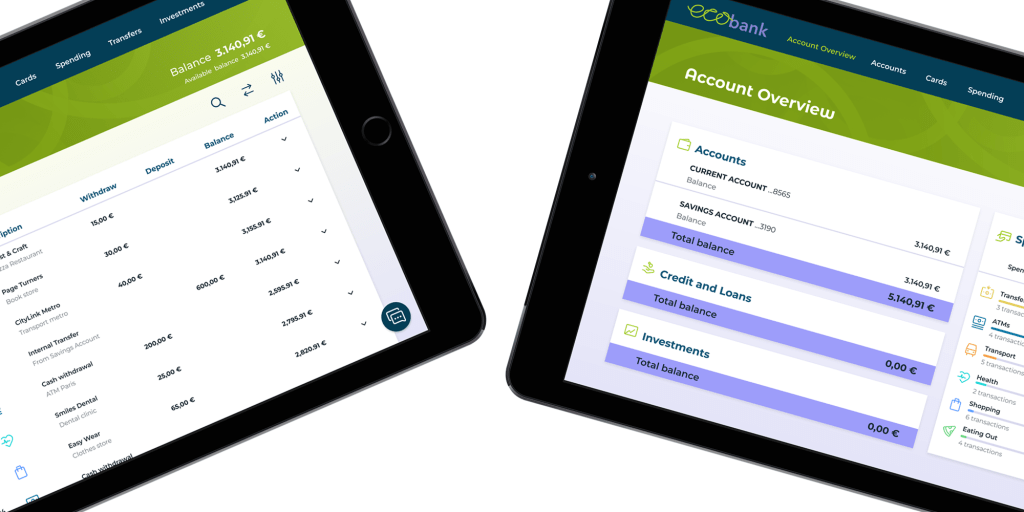
Account Overview

Current Account
My Spending
3. Reflection – reviewing the outcome
When designing the app, the primary challenge was finding the right balance between playfulness and trustworthiness. Another difficulty was adapting the screen design for various devices, ensuring an optimized user experience that accounted for each device’s unique capabilities and limitations.
 Anna Kononenko